The musings and offerings of a burgeoning greetings master

Showing posts with label Picket Fence Studios. Show all posts

Saturday, August 22, 2020

Mr Cardmaker is Very Impressed by Picket Fence Studios

Well, this is the last of the projects I have to share for my guest designer spot for Picket Fence Studios. I had a terrific time, and I thank PFS for having my along for this August 2020 release.

They have a new stencil, y'all! It's the Evergreen Stencil, part of this month's release, and it's this sweet, delicate tree line. I was so sure I'd end up manhandling it and balling it all up, but I didn't do that at all! It's very sturdy for its delicacy, and I had lots of fun with it.

I made this--

So, I really love the technique of using a stencil as an embossing tool. It's so easy to get fantastic impressions by running through your diecutting machine with an embossing mat.

Now, this stencil is just four trees, and I knew running a previously embossed panel BACK through your machine lessens the impression, so I had to do a bit of planning to get a foreground and background effect.

What I figured out was to run my background trees through first--that meant placing my stencil at a higher point on my panel and running it through my machine, then shifting t a bit further down, running that through, until I got to where I wanted my foreground trees. Those last ones had the strongest impression, and gave the distinct idea of being a foreground.

Next, I ever-so-gently went over my impressions with a bit of green ink, making sure to aim only for the raised areas on my panel. That done, I went BACK (brave? cocky? stupid? You decide...) in the same way with Versamark ink, and sprinkled the surface with some holographic embossing powder.

I held my breath, and heated it up. I could NOT be happier with the results. The foreground actually looks like a foreground, and the background...well, you get it.

I inked the edges of my panel for a bit of depth. I DO NOT recommend using your best blender brush for this. I had glitter in that thing for days! The things we do for our art...

I heat embossed a gold sentiment from the Good Vibes stamp set (previously released) onto a strip of vellum and wrapped it around my panel. I added some clear sequins, and some glittery Nuvo drops, and this card was finished. I love it!


But there's just one more!

I made this--


The delicacy of this stencil kinda had me a bit intimidated, I have to be honest. I was a bit afraid to use it, because I thought I'd move it and ruin everything.

Well, I was wrong. All I needed was a bit of repositionable spray adhesive. Lots of people are using Pixie Spray these days, but I have a can of something I bought when I was stenciling a wall a while back, and so I am using that until it's gone. It seems to do the job!

Anyway, with rainbows being such a big thing these days, I decided a Christmas rainbow was in order.
I was really happy to see how easily my Distress Oxides blended onto my slimline panel, and my stencil held on like a champ, and came off again clean as a whistle!
I offset the stencil to one side and another as I moved down the panel and changed colors, and I was pleased with the results.


To emphasize the Christmas feel of the card, I replaced the stencil over the green area of my panel (so easy to do) and added a much darker green ink than I started with. I liked it, but it was the addition of red and gold Nuvo drops that really brought the Christmassy feel home for me. 

I gold heat embossed another sentiment from Good Vibes on a pink strip of cardstock, chopped it up, and then backed each piece with a scrap of vellum. I felt that the vellum really visually elevated the little pieces. Those were all foam mounted onto my panel, and were joined by a spray of clear sequins. Christmas is never too shiny!

So, that's it for me! Again, thanks to Picket Fence Studios for the opportunity to experience this collection of beautiful stamps and stencil, and for asking me to share with you how much I enjoyed working with them!  Everything is available now at the website, so stop by.

Thanks so much for stopping by and sharing your valuable time with me!

All Best-

Richard

Friday, August 21, 2020

Mr Cardmaker Gets All Shook Up for Halloween and Picket Fence Studios

 I think my Halloween cards are some of the most fun I make all year, and I tend to save them for my crafty friends, because I think many of us feel the same way!

I'm guest designing for Picket Fence Studios this month, and the August release has a really fun stamp set for Halloween called A Spooky Day. There's a wonderfully spooky haunted looking house that I'm REALLY happy to have in my ever growing Halloween collection, as well as lots of other fun images.

I made this--


I first laid out my stamps to decide placement on my kraft cardstock panel, and when I was satisfied I removed them and ink blended white pigment ink and gray shades of Distress Oxide Ink in various places to make a cloudy, misty background. I misted water in places, and added ink spatters to add even more effect and depth.
 I then stamped the moon in many layers of white pigment ink, and then swirled more white around it to diffuse it. I next stamped the house and tree image in black pigment ink, and clear heat embossed it.
I colored the house by painting in shadows with Distress Ink, then came back when dry with a white pencil to draw in highlights. A little purple penciling adds a touch of color here and there.

The clouds were stamped and white heat embossed, and highlighted with some white ink.
The teensy-tiny (I mean, TINY!) leaf stamps actually turned out to be some of the most fun I had with this card. They fit into so many tiny spaces, and I had total control, because they're all separate stamps. Just a smattering of them on the ground, and a handful more tossed into the wind, they're stamped in black pigment ink, and also clear heat embossed to match the look of the house and tree.

I made a sentiment strip, chopped it up, and foam mounted it to my panel. I didn't find I missed any bling here, so I left it alone.

But wait, there's more!

I made this--


Grabbing another panel of kraft cardstock, my next idea was to find a way to make a "neighborhood" of spooky houses. I stamped them at varying heights and cut off the tree on the left side, and I was surprised to see how they really looked pretty different, all in all. 

To color things, I merely ink blended the edges of my panel, and then went back to my favorite white pencil to add some simple detailing and highlights I used a cloud stencil from my stash to create a bit of dark sky between the houses, and added ink spatters and spatters of water mixed with some perfect pearls powder to make some shine.

THEN--

SMEAR! Right at the top of my sky. A big, black, nasty smear. I hate it when that happens.

I thought, and thought about how to fix it--I thinked and I thunk. I finally decided to amputate it. I fussy cut around the images, and somehow thought that a circular span connecting the two houses was a good thing. Why not, right?

So, then, I used my stamping tool to help me curve a sentiment to fit my arc, and that got stamped and heat embossed. I added a companion sentiment in white, but I was still not sure what I was ultimately doing.

I finally was inspired to make it into a semi-frameless shaker card! I added some cloud stenciling to a panel of Halloween paper from my hoard  stash, then piled a variety of sequins and glitter and mica flakes onto it and covered it all in acetate to seal it in by taping it to the back of the panel. this made my frameless shaker. 


All I then had to do is glue my trimmed panel with the houses to the shaker, and add it all to a card base. I added some extra sequins and yet another sentiment to the front, and this thing turned out better than I ever planned!

All this Halloween fun can be yours, too, by visiting the Picket Fence Studios website and seeing (and buying!) all the fun things in the August 2020 release, available NOW!

Thanks so much for stopping by!

All Best--

Richard

Thursday, August 20, 2020

Mr Cardmaker Tries to make the Hard Stuff as Pretty as Possible

Well, when it comes time to make sympathy cards, it never seems like it's going to be a fun thing to do. My way around that is to make a good handful AHEAD of time, so I'm able to concentrate on the card making, rather than the sad occasion. 

And PET sympathy cards...ooooh, boy. Might even be worse.

Anyway, when it came to making these particular cards, I at least had a sweet face and lovely sentiments to keep me company. 

Today I'm sharing cards made with the Stella Puppy stamp set, part of the August 2020 release from Picket Fence Studios.

I made this--


The idea of the Rainbow Bridge, the place where our sweet pets wait for us to meet them until our time comes, is a lovely and hopeful one. And, there's rainbows, so how could you go wrong?

I made a panel of rainbow colors with cardstock scraps in my stash, and was THRILLED when clear embossing the puppy image on top of it worked out as well as I was hoping. Even on the yellow, things are nice and clear.

A simple white embossed sentiment from the stamp set is all that was needed, but I did add some white Nuvo drops, because I felt something was needed, and sequins and other bling didn't seem fitting.

I die cut the panel with a stitched rectangle die and foam mounted it on a white card base. Simple is best, I think.

For my next card, I wanted to keep the rainbow idea, but I went softer.

I made this--


Here, I did soft washes of color with watered-down Distress Inks, in rainbow order, of course. I came back and added water droplets and ink spatters, trying to concentrate the spatters to their coordinating colors, but not terribly worried about bleed over.

Once totally dry, I stamped and gold heat embossed the puppy image and added the sentiment, which I clear embossed to give it more substance. Some tiny gold Nuvo drops finish things off.

In a bad time, it's nice to have a happy thought and some pretty colors to hang onto, as well as the support of friends and loved ones. Paper hugs, y'all.  Send some.

Stella Puppy and many other new products in the August release are now available for purchase at the Picket Fence Studios website. Check it out!

Thanks so much for stopping by!

All Best-

Richard


Wednesday, August 19, 2020

Mr Cardmaker is BUGGY for Picket Fence Studios

I'm back to help introduce the August Picket Fence Studios release, and today I'm staying in a natural vein, and sharing projects made with the new Moths stamp. This is a background stamp, about 3 1/4" square, which seems small, right? However, this stamp is drawn in such a way that it's wicked easy to stamp them in series and easily match up the edges, creating any size image you want.

I decided to keep it on the simple side today, though, and made a card with just one stamping--well, one and a bit extra...

I made this--


Aren't these moths just too cool? I stamped them onto a panel I made using Distress Inks and the "smooshing" technique, some water spots, and some ink spatters. This is one of my favorite techniques- always unique, and always fun to do.

My moths are gold heat embossed. I like the elevated feel, using the gold. I also colored  a scrap of cardstock, stamped and gold heat embossed just a portion of the image, and fussy cut one of the moths. I added it with foam tape to the bottom of my feature panel to give it just a bit of action.


My sentiment, which is far too perfect for far too many of my friends, comes from the previously released  Never Faked a Sarcasm stamp set, which is quickly becoming a favorite of mine. I gold heat embossed this onto a deep blue card panel.
I double matted my focal panel, and added it to my blue panel. A few gold Nuvo drops were the final touch before I mounted it to a white top-folding card base.


For my second card, I decided to use the Songbirds stamp set along with the Moths.

I made this--


I'm a big fan of mixing a snarky sentiment with sweet images. It makes me laugh.

I started with a panel ink blended with Distress Inks and sprayed with water to activate the colors. I set it aside to dry while I moved ahead elsewhere.

I ink blended several green Distress Ink shades onto another piece of white cardstock. I then stamped the Moths stamp with black ink, let dry, then offset it just slightly, and restamped in versamark ink; which I followed up with white embossing powder, and heated until melted and shiny. I then diecut the word 'hiya" with dies from my stash, and got to making an arrangement for my card.

I stamped the bird and sentiment in black pigment ink and clear embossed them. Once I knew where my letters would go, I stamped the bird's feet onto the H so he would look perched on top of it before foam mounting my letters. This is definitely easier to do BEFORE adding the letters to the project! 

 I decided to point up my focal panel with some striped paper and a skinny cardstock strip. I didn't have the correct color cardstock , so I used a direct to paper inking to make the proper blue for my strip. Matching makes me happy...

Just a few sequins to finish up!


The Moths and Songbirds stamp sets, along with lots of other fun things in the August release, is available right now at the Picket Fence Studios website. Check it out!

Thanks so much for stopping by, and spending time with me.

All Best--

Richard

Tuesday, August 18, 2020

Mr Cardmaker Takes Flight with Picket Fence Studios

Well, I've definitely caught the slimline card bug. I love having more space to play with, and layout options certainly increase with a slimline card.

I also have a big thing for birds. We live in Florida, and we have a small pond behind us that backs into a nature preserve, so the plethora of birds we get to see every day is amazing. I also have a good number of ceramic birds throughout my house, because I can't seem to get enough.

Picket Fence Studios asked me to guest design for them for this month's release, and I was so happy when I saw the Songbirds stamp set! 

I made this--


To start, I used washi tape to mask off stripes on a panel of 80# cardstock. This is just about as easy as it comes, and you can easily eyeball the placement of the tape. Working on a diagonal relieves the need for perfectly straight lines, too. I also decided to mask an area where my sentiment would ultimately land with a diecut I had on my desk. I ink blended several Distress Oxide inks together, sprayed the panel with water and splattered some ink on it to give it some texture (and disguise any awkward blend points) and allowed it to dry.

Once I gently removed the washi tape from the VERY dry panel (otherwise, it almost ALWAYS will tear), I decided where my birds needed to be in my design, and diecut windows for them with various sizes of circle dies. I also blended some ink into the sentiment area I had previously masked, using the mask for shadow, and the negative to add color to the banner. I then stamped my sentiment in both blue and versamark, and clear heat embossed it.

On my card front, because I'm crazy this way, I marked where my birds needed to land, and carefully ink blended and spattered these areas. If you notice the bottom bird, I actually masked a border to line up with where my striped panel would land. I then stamped my birds, and did some easy coloring with colored pencils.

It was then merely left to the mounting of the striped panel, which I did with foam tape. A few clear sequins, and it's done!

For my second card, I decided to do a holiday card. My grandmother always had birds on her Christmas tree, and I've always had one or two in my tree because of it. I thought these birds would make pretty ornaments, so...

I made this--

 I embossed a panel of cardstock with an embossing folder from my stash. Now, using an embossing folder on a panel for a slimline card can be tricky, but I was careful with my placement so there'd be no overlap, and in the very few imperfect places that came out, I was easily able to hide things under ornaments.

The ornaments were cut using some Spellbinders dies that have been in my stash for ages. They have a vintage-y feel to them, and I like how they work here. 

Birds and feathers were heat embossed, both in gold and with clear over red ink, and I was able to get a tiny sentiment from the stamp set onto one of the ornaments. It's not a Christmas sentiment, but I can't imagine anyone would not realize the theme here...


To decorate the ornaments even further, I used a Versamark pen to draw on some details and dots, and heat embossed them in gold. Never too much sparkle at Christmas, I say!

The only tricky/tedious thing for me was the tying and securing of the gold thread that I used to "hang" the ornaments. It was a bit fiddly, but I succeeded at the end, and I mounted everything at various heights with liquid glue and foam tape. To fill in any bare spots, I added some dots of gold Nuvo drops.

I'm happy to have another card to add to my very slowly growing collection of holiday cards for this year.


I have another card with that sweet little chickadee on it, but it also uses another new stamp set that I will show you next time, so stay tuned! You'll be buggy about it!

Be sure to stop by the Picket Fence Studios website and see the Songbirds stamp set and ALL the new release, available now!

Thanks for stopping by!

All Best--

Richard


Monday, August 17, 2020

Mr Cardmaker Colors It Up for Picket Fence Studios

My third entry for my guest spot for Picket Fence Studios this month uses a happy scene in the Your Friend Dear Stamp set. This image is so much fun to color in a variety of ways, and the sentiment is sweet and snarky at the same time, so, yeah, I'm all over that one.

First, I made this--

I actually remembered to pull out some bristol smooth cardstock for this one--I usually default to 80# cardstock, and then hate myself when I go to color things with watercolor markers.

This is a delightful scene, with the girl suffering her companions to wear the same bows she has in her hair. They certainly don't seem to mind too much, considering how it IS for their friend.

I stamped this in Memento Tuxedo Black ink to start, using my MISTI stamping tool, and reminded myself  to NOT remove the stamp. I also stamped the image on masking paper, which I trimmed out and applied to my panel over my image. I used a cloud stencil from my stash and Distress Inks to ink blend the sky for my scene, and then cut a quick homemade stencil from a die in my stash to create the grass line, which was also ink blended on. I LOVE my blender brushes from Picket Studios. They are sooo soft, and they blend beautifully.

I was then able to remove my mask and get to coloring. I used my Zig clean-color water color markers and a water brush to color everything, using a bright green to point up all the bows. Being so close to the grass, I could've used some other color for the bows, especially considering the cat's placement, but I added Ranger Glossy Accents on top to point things up, so I think it ultimately works. 

To finish, I put my panel back into my MISTI, and restamped the image in Versafine Onyx Black ink, to deepen and crisp up my black outline.


After drying, I used a white gel pen to add some bright white highlights to my scene, and added some clear sequins to add interest. I white heat embossed the sentiment onto a black strip of cardstock, added some foam tape to the back, and adhered it to the panel. 

I found a great striped paper deep in my paper stash that had lots of the colors I used, and used it as a backing on my white top-folding notecard.

Cheerful, right?

Well, I had to do another, and I had to explore other options while I was at it!

I made this--


I LOVE making cards with Kraft cardstock. I think I use it about one in every five cards I make.

Here, I stamped in Versafine onyx black, and then got out my colored pencils.

My animals stayed pretty much the same--I have a friend who has a HUGE white Great Pyrenees dog, and I just love an orange cat, so...

I thought this girl's hair lent itself to work for many ethnicities, and so here I went with a dark complexion. I love this. I was worried as I colored that I was kind of spotchy and that things weren't working as I wanted, but then I remembered my VERY good friend when it comes to pencils--GAMSOL!

Gamsol is an odorless mineral spirits that allows you to soften the look of your pencils by blending them. My photographs pick up some of the reflections of the pencil strokes, but in real life things look really soft and blended. I used lots of gamsol and many blending stumps, but in the end I was really happy with my results. I definitely consider myself a super novice where coloring is concerned, so this is GREAT for me.


I white heat embossed a sentiment from the previously released Good Vibes stamp set and mounted my panel to a white top-folding notecard. A few white Nuvo drops, some Glossy Accents on the dogs nose and cat's nose and bell, and I was DONE!

This is a great image to color, whether you're a novice like me, or have huge amounts of experience and talent for coloring. This and many more stamps from this release can be found at the Picket Fence Studios web site. Be sure to check it all out!

Thanks so much for stopping by!

All Best--

Richard


Saturday, August 15, 2020

Mr Cardmaker Ties It Up with a Ribbon for Picket Fence Studios

Today I have some more cards to share with you, using a stamp from the August 2020 release from Picket Fence Studios. I am guest designing for them this month, and I am so grateful for the opportunity.

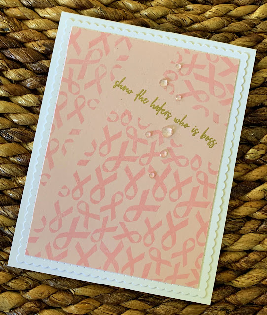
Today, I am sharing cards made with the Hope Ribbons background stamp. This stamp measures about 3 1/4" square, but it's made so it's very easy to line up and connect the image to achieve a custom size, making it easy to create a card, a tag, or even a scrapbook page.

Using ribbons to show support for various causes is an everyday occurrence. Ribbons of every color of the rainbow catch our eye and remind us of ongoing struggles every day that people face, and those who work tirelessly to support them as science works to find cures.

As cardmakers, we do our part, in part, to support those in need with messages of paper and ink. Paper hugs, some like to call them.

Today, I have two such paper hugs to share.

First, I made this--


I think this is the first ribbon I recognized being worn on a large scale, to support those living with HIV.
I've learned that a diagnosis of any major health issue comes with myriad emotional trials--and as with all things, I work to slap a snarky face on just about all of them. This sentiment from the previously released Never Faked a Sarcasm stamp set seems perfect here to me. I leave it to you to figure out the meaning.

To create this card front, I stamped the image on both white and red cardstock, then trimmed both to fit together on the card front. Notice here how I was able to almost seamlessly pair up where the image ends and another starts. It's nice to work with a stamp that gives you a variety of uses and is so easy to expand for a larger background.


I did a small amount of ink blending on the edges to soften them, and I white heat embossed the oh-so-very snarky sentiment on the red section for the most impact. I felt that blinging this one up was unnecessary, so I trimmed and foam mounted my panel onto a white top-folding card base and stepped away.

I have uttered this sentiment in daily life a number of times. I will do so again when appropriate, too, I'm sure...

My second card supports a cause that has been a part of my family for many years.

I made this--


I love how you can connect the image so easily, but here I wanted to use it in a more disjointed way, like the way cancer can shatter lives so easily. My mom has been living with breast cancer and metastases for many years now, and while she has been in several remissions, there always seems to be another shoe ready to drop at any moment.


Here I felt freer to go more feminine, with scallops and gems, and pink-on-pink. I used one of the stamps from the It's Peopley Out There stamp set for the sentiment, and heat embossed it in gold. I love this sentiment. 

Fights with health issues are often long and hard. I think giving someone a smile in the midst of things is the very least we can do. Do it, early and often. 
Paper hugs, y'all. Paper hugs.

I have more to share over the next few days, using items from this August release from Picket Fence Studios. Be sure to stop by the website to see much more! 

Thanks so much for stopping by!
All Best--
Richard


Friday, August 14, 2020

Mr Cardmaker is Guesting for Picket Fence Studios!

Well, the wonderful Lydia Fiedler asked me to be a guest designer for Picket Fence Studio's August release, and of course I said yes! I am excited to be among the first to play with these stamps and stencil, and I am so grateful for the opportunity to introduce these products to you.

Picket Fence Studios sent me a big, beautiful bunch of fun things to play with--seven new stamp sets and a stencil, to be exact (including a big handful of their WONDERFUL blender brushes), and I have to say I went kind of hog wild with them. I managed SIXTEEN cards, in total!

Picket Fence Studios is sort of a "new-to-me" stamp company, and in my initial foray into their web store, I managed to find some great, both snarky and sweet sentiment stamps from previous releases that I had to have. I'm pairing those with all my new things for this release, and I had a blast making with all of it.

I feel a need to divulge to you, guest designing with brand-new, never before seen items is a more-than-fascinating experience, because you are left to your own creativity with EVERYTHING. There's no one's ideas to play with, no photos to refer to...YOU are the one to make it happen. At first it was a bit daunting, if I'm honest. But, once I got into things, I was able to just run with it, and I had TONS of fun! 

The first stamp set that really spoke me was the new Leaf Mandala stamp. I'm a sucker for a mandala--I love the structure, the design variations...too good. This one is perfect for fall, with its fallen leaf motif. I made two cards with this one right away, and I know I'll be making tons more for the season, because this was so easy to get big results with. 

I made this--


I stamped the image onto the center of a panel of 80# cardstock with Versamark ink, did partial images above and below it, and heat embossed everything with copper embossing powder. These lines are pretty delicate, but they held up beautifully to the embossing process, retaining all those tiny details.

My next move was to color all the tiny leaves with my Zig clean-color watercolor brush markers. I did this super quickly, not worrying about every nook and cranny, just getting color onto the leaves.

Then, I ink blended Blueprint Sketch Distress Oxide in around the mandalas to create a background. 

At this point I was ready for the fun part.
I grabbed my water sprayer bottle and even though I was working on cardstock and not watercolor paper, I sprayed the heck out of the center of the mandalas, loosening all those watercolors and letting them spread over the front of the card panel. I kept a paper towel handy, to keep things from getting out of hand, but the important thing to me was to set those colors loose to run free.


I love the way the reds and yellows almost explode from the center of the mandala, connecting with the one above and below. I set this all aside to dry, and when I came back to it, I recolored the leaves a bit, because they did dry back just a little too light.

When it came to a sentiment, I didn't want a solid sentiment strip that would hide any of the "good stuff", so I white heat embossed a sentiment from the Good Vibes stamp set onto a vellum strip. and wrapped it around my panel. After popping up the panel onto a white top-folding card base with some craft foam, I added some white Nuvo drops to the vellum, and this card was done!


For the next card, I went for a very easy to produce card that counts on bold color to make a statement.

I made this--


More mandalas = more better! Pardon the horrid grammar, but it IS true...

So again, I stamped and heat embossed mandalas onto cardstock, but this time I used both clear and gold embossing powder.
After adding the gold heat embossing, I did a light ink blend with Broken China Distress Oxide ink around the mandalas to create a background. I then stamped more mandalas with Versamark ink and heat embossed those with clear embossing powder, then added more Distress ink on top of that to give  a subtle mandala background that really catches the light beautifully. I made sure to leave myself room to white heat emboss another sentiment from the Good Vibes set, which I added as soon as I made sure my background was sufficiently dry.


Coloring the gold mandalas couldn't be quicker or easier. I used autumn colored Distress Oxide inks and my Picket Fence blender brushes (OMG, SO SOFT) and layered them, going back and forth from light to dark, with the darkest part at the center.  I finished this one by adding just a few gems and sequins.

The contrast of the bright blue with the orange and gold colors gives me the feeling of falling leaves blowing in a bright, crisp autumn sky. This is a bold statement that came together so easily--I can't wait to do more of these with different color combinations.


So, these are the first of the cards I came up with for this release. I hope I was able to inspire you to create some beautiful fall cards of your own with this Fall Mandala stamp. Stay tuned over the next weeks as I share more of this terrific August release from Picket Fence Studios, and be sure to go to their web site to see even more of the release, available as of TODAY, August 14, 2020!

Thanks so much for stopping by.
All Best--
Richard