The musings and offerings of a burgeoning greetings master

Friday, October 18, 2013

Mr. Cardmaker Can't Help Himself

Well, I really don't have many people to send Halloween cards to, and so I TRY to stay away from making them. I also don't have that many people coming over during the fall season, but it doesn't stop me from decorating with all my Fall stuff, either!  LOVE me some Autumn!!

Anyway, I ran across my jar of Amuse Studio black glitter the other day, AND I got my Authentique Enchanted paper pad from Oozak recently.  What can I say?  What could any self-respecting, over-shopping crafter say?  I could NOT help myself! 

Photo-heavy post ahead!  Get ready!

I made this--


I stamped the haunted house onto some SU Summer Starfruit cardstock and fussy cut it.  I covered it with Glossy Accents, and when it was dry, I restamped the image onto my paper, and adhered it.

The tree is a Memory Box die.  I covered cardstock with my 2" Scor-tape and ran it, with the die, through my Cuttlebug, took off the liner paper, and covered it with black glitter.
 
NOTHING says Halloween more to me than black glitter all over something! 

I stamped my spiders, then assembled the card, adding strips of paper and some hand drawn squiggly lines to fill out the design.  I added more scor-tape, in thinner strips this time, and glittered them up, too.  This makes SUCH a wonderfully clean line of glitter!  Once you get me started with the glitter, you better keep moving, because if you're sitting still, you could be "made pretty!"

I moved to the inside of the card, and I did this-- (all of my interior photos are weird for some reason. Sorry!)

I masked off and stamped the edges of my cardstock with a web stamp, and was really happy that just a tiny border read really well.  The sentiment stamp is so great, with the skull and pumpkin lurking in there.  I did get that smudge, but I let it go, what with it being all Halloweeny and all.  I will add more smudges before I send it, probably.

I was so happy with the Scor-tape as adhesive idea, I kept going.
I made this-
This one is being entered at Ribbon Carousel, for their Fall/Halloween challenge--

I made the glittered leaves with more scor-tape, then layered them with a plain cardstock leaf for contrast.  I love that look!  I did these with my Fiskars punches.  They were not happy about cutting through so much at once, but they finally did it!

Here's a better look--


To do the cat and sentiment, I used some Sticky Powder from Gary Burlin and Co.  I was not terribly thrilled with the amount of "sticky", to be frank, and will have to try another variety.  I got the general idea, though, and I was able to go back and add some glue on top of the cat, so I could reapply some more glitter.  The sentiment was to thin for me to mess with, though. I keep looking at this one, thinking I smudged it next to the cat, but it's part of the paper, I SWEAR!

I added some black twine, and I used my 1/4" hole punch to lock it into place at the top and bottom of the card.  More Scor-tape and glitter at the left side there, but you already knew that...

I did the inside of this one too, like this--

I love that sentiment stamp from Studio G.  (All the stamps are Studio G, btw, except for the clouds and the swirls on the first card which are from PTI and Inkadinkadoo, respectively)  I think the hand drawn lines really work with the webs here, too!

Finally, I had to do one more--

See how I am good about not wasting any of my papers?  Because I'm stingy frugal like that!

So, clearly I couldn't stop at just the black glitter, and I had to get out the orange as well for this one! 
The dies here are from Papertrey Ink, and I added more of those punched leaves, one glittered and one not.

I like the gray rhinestones added to this one!

The inside of this one looks like this--


I added the speckles after I found a speckle-sized smudge.  I think they work here!  That big spider is so great for a creepy surprise!

So, that's my Halloween collection for this year.  I will definitely make sure they find homes (along with the couple of cards I made last year, and THIS CARD. 

I love making them, and I will send them to those who love them.  Seems it's always my crafty friends who REALLY appreciate them!  Plus, sometimes I get some in return!  Love that!

Thanks for stopping by!
All Best-
Richard

Friday, October 11, 2013

Papertrey Ink Make it Monday Challenge and ABNH Shape it Up Challenge

       ***This is my second post today.  Scroll down to see my paper-laden Get Well card.***


Well, I am trying to get into some more contests these days.  Seems you get a bit of exposure that way!  (BTW, you ARE all telling your friends and neighbors about me, RIGHT?)

I made this--

 
I made this card, (Which is actually on the small side--Probably best used as an enclosure) for Papertrey Ink's Make it Monday challenge, which this week is to use a layered embossed technique.
I also wanted to enter A Blog Named Hero's Shape it Up challenge, and I did it as a shaped card.
 
I had also planned to enter Case this Sketch's challenge, and Simon Says Stamp's  Dotty challenge, but I was too late on the trigger for those.  Wop, wop....
 
I started by making my base with a Spellbinders Labels Four die, the largest one, on white card stock, and then made another die cut to be the card front. This way, the fold wouldn't show at all.
 
I stamped the background with my dot background stamp (my only non-PTI stamp used here, btw) and then stamped over it with the balloons and sentiment for PTI's Birthday Basics set.  The balloons were stamped in versamark, which I then embossed with clear powder so the background would show through.  I then used three purple inks to highlight the embossing, which, of course, left the background of the balloons the dots on white. 
 
I added some of the dots from Birthday Basics , and hand drew the strings of the balloons on with my white gel pen.  Add a few sequins, and this pup is ready to sign and mail!
 
I really enjoyed doing both (all) of these challenges, and it was really fun finding a way to combine some!
 
Wish me luck!
 
Thanks for stopping by!
All Best--
Richard


Mr Cardmaker is Letting the Paper Do the Work

Well, in the continuing story of "I need a card, NOW", I found myself in need of a masculine-ish (because you know about me and masculine cards, #dontgetmestarted) get well card.

*Now I am laughing, because I do NOT tweet, and am not sure what that hashtag nonsense even IS.  Please ignore my madness...*

ANYWAY--

I have a HUGE assortment of cards hanging about.  THREE shoe boxes full, to be exact.  Do you THINK I had what I needed in all of that? 

Nope.

Well, it was off to the craft room, at a rather late hour, to come up with something.  Happily, I had just loaded up on all kinds of new 6x6 paper pads, and I found some really good inspiration.

I can go crazy with layers, or super minimal with a CAS, but that middle, nice-card-with-not-so-much-stuff area gets wombly on me sometimes. 

So, I let my papers guide me this time.
I came up with this---

 
Now, this is nice, right?  Strong colors, nice geometrics, not so fru-fru.  These papers actually had been cut for some other project, so I played around with the scraps, and added some new pieces where they were needed.  I do love my scraps!  All in all there are seven (!) different papers on this card, all from the same paper pack.  Oh, it's My Mind's Eye Dilly Dally, under the Miss Caroline label.  Everything is layered on a chocolate brown card base.
 
The sentiment is embossed with Stampin' Up Early Espresso powder, and I don't know if it was this project, or my versamark was dry, or what, but I was not a fan of that stuff.  I'll have to play with it some more, but it wasn't sleek and shiny, and I'm really pretty sure I didn't overheat it.  Anyway---
I thought it was getting a bit lost on the dots, so I swiped some white pigment ink over top of the area, and wiped it back off the letters with a baby wipe.  Gently does it here!  I like that the effect looks like a worn fabric.
 
That button is actually some replacement button for a pair of shorts I bought recently. It kind of looks like leather, so I liked it for this project.
 
So, while this isn't SUPER simple, it was made easier by letting the paper take center stage.  I do like to pair up papers and cardstocks and all the rest of the stuff, but this one just came together with the paper all by itself. 
 
 
Thanks for stopping by!
All Best--
Richard


Thursday, October 10, 2013

So, This was a Cool Thing

While bouncing about in Blogland recently, I happened upon a really cool site, called Tagxedo.com.  They do this word cloud thing, and you can use your favorite words, or you can link to your blog, or a website or whatever, and it picks the most used words and it seems to give them this hierarchy thing as it makes the cloud. 
 
So I did my blog!  This is what I got--
 

Pretty cool, right?  I don't know why the word "stopping" made it to be so big.  I will have to read some entries to see how often THAT one is used...Maybe it's not such a word hierarchy as I originally thought.  I was pleased to see the word "love" being so prominent.  Apparently, I use the words "really" and "thing" WAY too often...

Isn't this FUN?!  Imagine doing this with motivational words, or fun things your kids say....

Just a fun thing to look at today!
Oh, and PS--Charlie was out of town this past week, so my card pile has grown.  Lots of fall and Christmas cards coming up!

Thanks for stopping by!
All Best-
Richard

Tuesday, October 8, 2013

Get Well Wishes for a Lovely Lady

Our wonderful friend, Betty Ann, is eighty-something, and manages to live alone with her cat, and just a bit of help that comes in a few times a week.  Well, she had a fall in her tub, or into her tub...we are not too sure.  At any rate, she broke her collar bone, no fun at any age, so she has herself a bit of an uphill battle ahead.

Her assistant let us know what is going on, and mentioned that the only thing we could really do to help is to send her one of my cards.  Isn't that just the sweetest thing, ever?  Well, I wanted to get one out to her right away, and I had nothing on hand.

To the craft room, Robin!

Boy, the moment you need a card is NOT the moment for the mojo to vanish.

I grabbed some inks and a stamp set from my collection and got down to it.

I came up with this--

So, I began with stamping a background, using 4 colors of ink, and stamping without reinking as I worked my way across the card.  The boldest ink was toward the middle, and then got lighter in both directions.

Once that was done, I used sponges too ink up the edges of the cardstock, one color for each side.  When that was ready, I attached it to the front of a cardbase that matched one of the inks.  The sentiment was done in the darkest color--here, an olive green.

I stamped and punched out more of the same flower in the same colors and inked the edges.  I pulled out my glitter collection to do the centers, because I really love my shiny surfaces. These were adhered with some foam tape, but looked lonely without some foliage, so I went back and added some die cut leaves.  The leaves were a bit dull on their own so I took my white gel pen and gave them a doodled look.

In my continuing search to make everything more shiny, I added rhinestones in the colors of everything else, and I called it done!

I barely remembered to get a photo before getting this thing into the mail, but it got off safely, and I hope it's now in a spot where Betty Ann can get a good look at it in some sunshine. The glitter looks best then, of course!

We are hoping Betty Ann is much better in a big hurry, and that her feet stay securely underneath her in the future. I'm sure all good energies sent her way would be very appreciated, as well!

Thank so much for stopping by!
All Best--
Richard

Monday, October 7, 2013

Crisp Temps and Falling Leaves

We finally have some blue skies today, and I am hoping that means some cool temperatures came with them.  Weird, warm wetness is NOT my idea of a good time, let me tell you.  I want my AUTUMN! 

Speaking of, I have an Autumn card to share with you today.  I was playing around with some masking techniques, and I am happy with what happened here.

I made this-

 
I masked and inked that colored panel, using a wicked old text stamp from Inkadinkadoo, and many, many inks.  I started with the yellow in the center, and moved my way to the darker edges, adding  layer after layer of ink. Some of the inks were Distress inks, so they did some really cool things when I flicked water on them.  Pull off the mask, and it's ready to mount onto a Kraft card base.  I love that wicked crisp line!
 
The leaves stamps are from GinaK Designs Fall Foliage, and I used sponge daubers to get the colors right.  I tried to do that "rock and roll" technique, but the lines just didn't blend well enough for me.  I like how the daubers did.
 
I fussy cut the leaves, curled them with my bone folder, and mounted them with runner and foam tape.  I left quite a bit of air under areas, and I love the look.
 
I used a punch to add grooves to the top and bottom of the card, so the twine would have a nice place to nestle.
 
On the inside, (sorry, no photo) I did another piece of the cardstock, and did another small leave at the bottom-left corner.  No sentiment needed!
 
Well, I am off to take my walk.  If I get to wear a jacket, I will be VERY happy.  Autumn is never a lengthy visitor.  I want to make the most of her!
 
Oh, yeah, we DID make it to the cider mill for apple cider doughnuts already, so we have that going for us.  Now I need a stack of pumpkins, and I will be pretty well set.
 
Thanks for stopping by!
All Best-
Richard


Friday, October 4, 2013

Spooky Scenes

I am playing with this weeks Curtain Call Spooky Scene challenge, and the Ribbon Carousel Blog's challenge!  I pulled out my favorite owl stamp, from GinaK Designs, and some other stuff and got to work.

This is the inspiration photo--


Aaaaaaaaand, mine really has nothing to do with that photo.  LOL!  (Ok, mine has a bird in it...)

I made this--

It's hard to see, but the black frame piece is embossed with a clockworks embossing folder.  I'm sad it doesn't show up better here, but then again, neither does the glittery stuff I did.

So, I started by coloring my white cardstock direct to paper with a grey inkpad, after masking out a circle for my moon.  I colored my moon with a dauber, and then stamped some clouds with more of the same grey ink.
I stamped the owl, colored him with colored pencils and a white gel pen, then masked him off and stamped my sentiment.  I added the swirling leaves at the bottom, and to keep it sort of spooky and dark, went with mostly brown and yellow pencils. 
I used a yellow copic marker to trace around my moon and owl, to add a glowing effect.  There is actually some Sakura glitter pen accents in the letters and on the owl, but they didn't photograph at ALL.  It looks cool, though, especially in the owl's eyes.  Kinda gives that "animal in the headlights" look.

The black frame is mounted over the image with foam tape, and the whole thing is on a yellow green card base (Summer Starfruit for you Stampin' Up folks), which is a fun surprise when you open the card.  The twine has a yellowish color, which speaks to the yellow in the image, and that awesome crystal-y button is also from Stampin' Up.

I LOVE making Halloween cards, but very few people (other than crafty folks) really care about them, so I don't do many anymore.  This was so much fun to do, though, so maybe I need to start back up with them.  I better get going, if I'm going!

Thanks so much for stopping by, and get over to Curtain Call and play along if you get a second. 
All Best!
Richard

Thursday, October 3, 2013

The (Clean and) Simple Things Make Me Happy

I spend a good amount of time following card blogs, and I try to make sure I find EVERY giveaway out there.  FREE is my favorite word, after all!  I really like the ones where they randomly pic from the comments left by readers, because there's no WORK involved (although, crafting is never really WORK), and there's free STUFF sometimes.

I won some really GOOD stuff from Paper Smooches a while ago!  The Crystal Clear set, which has the ever popular Ball jar, AND some really cool bottle shapes.  I also won the Many Thanks set from them at another point (or was it at the same time?), and I LOVE that!

I used them to make this--

I just love how layering these bottles works!  I LOVE colored glass, and this is perfect for me.  I think I will try to see what happens if I rough up the surface of these stamps a bit, because the inks I used (Memento and Papertrey Ink)  are pretty splotchy.  I really don't mind the splotchiness here, but in other applications, I will probably want it a bit smoother.

I like how I kind of get the feeling of forward movement from the placement, and the small bits of sparkle from the sequins.  Happy colors, happy little sprig (Ooo, that was very Bob Ross of me).  All in all, pretty simple.  Makes me smile.

Do something that makes you smile today!

Thanks for stopping by!
All Best-
Richard

Wednesday, October 2, 2013

Love is an Everyday Occurence

This is my second post for today!
Scroll down to read how I pat myself on the back for my PUBLICATION TRIUMPH!
......................................................................................................


Well, here we are, Mr. Cardmaker and his Mr., twenty-two (22!) years later, and yes, miraculously enough, he still puts up with me! 

Our anniversary coincided with the appendectomy and the sinus  infection, so it was what you would call "low-key."  Like, "here's a card" low-key.  Hey, it works.

I made this--

I have no idea why this is so blue.  Same camera, same lights, same everything as always.   Weird.  BAD PICASSA!

So, the fun thing here, for me, anyway, is the GOLD being interjected into this here new fangled chalkboard thing I hear tell of. 
Is anyone already over this idea?  Don't tell the manufacturers!  There's new stuff coming out daily that lets you chalkboard better, faster and easier!

I just liked the colored pencil on the black cardstock, to be honest.  The gold embossing powder is one that I a NOT over yet, so stay tuned to more of THAT in the future!

The card is really awfully simple--Punch out and adhere hearts, a border punch strip, and some rhinestones on a panel of pink.  Add your matted image, and a little flourish with some ribbon and more hearts and rhinestones.

Oh yes--The gold hearts were made by embossing a small scrap entirely with gold embossing, then punching the hearts.  Just a little extra "sump'in'-sump'in'."

Oh! Charlie made ME a card!  I love it when he invades the craft room.  He puts stuff back (good boy), and he makes the sweetest things.  I will be keeping it private, however.  Suffice to say, he's a good one!


Is there one of those card making trends STILL going on that you wish would go away?  What is it?  Did you even TRY it? (Just curious--no judgments here)

Hope you find love as an everyday occurrence in YOUR life. 

Thanks for stopping by!
All Best--
Richard

Mr Cardmaker is in PRINT! Well, Digital, Anyway....

SO, I can finally tell you that I have been PUBLISHED!  TWICE!!

The Winter edition of CardMaker Magazine has hit the web, and there are TWO of my cards in it!  I am so stinking excited, I can't EVEN tell you!

I am holding back on posting the pictures here (because I don't know if I'm allowed to show them), but if you are a subscriber to CardMaker, (no relation, by the way) you can log in and be among the FIRST to see the new issue!  AND!  You can see MY CARDS!  (Not TOO proud of myself, am I?)

Uh, YEAH.  Picture me with a big, cheesy grin right now.  Yuppers, that's me.

Check it!
I'm not sure when the print issue hits the stand, but LOOK for it at your craft stores!

Thanks for stopping by!
Cheers!
Richard


Monday, September 30, 2013

Merry Monday

Well, I'm jumping into some Christmas card making today, by entering the Merry Monday Christmas Club #77 challenge at Always Playing with Paper.

The idea this time is to use red, pink, light green, dark green and white in a Christmas card.

So, I made this--

So, pink and lime green are my FAVE Christmas colors. Oh, and light aqua (though they didn't ask for any here).  For reals.  Add some red into the fun, and I am all over it.

You may be thinking the angle I shot the card at is awfully weird.  It was the only way to make all the glittery stuff work properly.  I have two glitter papers in the ornament (one is from a Springtime pad, don'tcha know) and there is Ranger holographic powder embossed as snowflakes on the striped paper.  Oh yes, and a tiny bit of Sakura red glitter pen on the scallops.

I made this card in about 30 minutes, because I wanted to get in on this challenge.  I may have reconsidered the twine and button, otherwise.  I think they lend themselves to a more rustic setting, really...

I do like the overall idea of this card, and I like these Spellbinders dies that made the ornament.  I bought them for like, $4.00 at Michael's last year after Christmas, and they should be some fun, decorating them!

*****UPDATE******

SO! I changed out the twine and button, after all.  Bad photo, but it looks like this now--


I think it's more in keeping with  the rest of the elements now.  Call me crazy....

Thanks for stopping by!
All Best--
Richard

Saturday, September 28, 2013

Tuesday Trigger, or Sometimes It Just All Comes Together

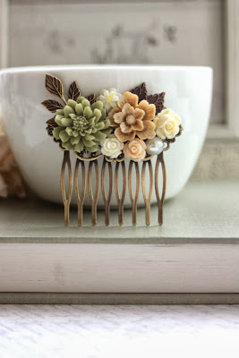
Well, this is just a quick one to get this card I made for Moxie Fab World's Tuesday Trigger contest.

This is the trigger photo--


Ooo, pretty, right?  Lovely colors, and nice shiny porcelain....

Ok, so I made this--

 
This took me a million hours to do, mostly because I struggled to do another card, only to go back and see I used TOTALLY wrong colors....I would have SWORN I remembered blue in that photo...
 
That one looks like this-- 
 
But wait!  Let me tell you about the one I LIKE first!
 
So, I really wanted to get the idea of the comb, so I scored vertical lines on the card front to reference them.  LOVE my Scor-Buddy for this stuff.  Now, I also love my Scor-pal, when I am doing big stuff, but for every day, if you have the choice, pick the Scor-Buddy.  MUCH easier to deal with.  I also see a TON of the Martha Stewart mini boards, but while they do have way more grooves, I hear about the stylus jumping all over your cardstock sometimes.  Don't have one, can't say for sure.
 
 
The text paper is from Stampin up, and I tore the edges and swiped the whole thing with white pigment ink, pad to paper, just to soften it.  On top of that is half a doily, then little sprigs punched with a Martha Stewart punch.  (A must have, for me)
 
The flower.  Well, I really wanted a peach flower, but I have NO peach paper.  How is THAT possible?  So, I used orange, and topped it with vellum.  Peach-ISH! Or peach via trick-o'-the-eye!
 
That's done with a SU punch and stamp set. I did the stamping in versamark, and embossed with white powder.  I love how some of the stamped part actually shows through the vellum!
 
The center is one of the old build-a-brad things from SU, and the center is a scrap of the paper I did the leaves with.  They're done with a Sizzix sizzlit on some VERY old paper I had been hoarding a scrap of.  Happy to use it in JUST the right spot!
 
The best part, for me, is where I get to reference the white porcelain bowl by using white enamel accents around the center brad, and in among the leaves.  Subtle shine, but nice impact, and that "little something extra."

Ok, now for the one that didn't make it--

So, remember the card I made HERE?  On this card I used the piece that was used as the stencil.  Waste not, want not.  I seriously thought a day after looking at the photo, that the flowers on the comb were pink and cream, with some green and a pop of blue.  WHERE did I get THAT from? 

This is a bit (!) on the fussy side for me, really, but I guess it's an okay card, all in all.

I was lucky enough to hear Vidal Sassoon speak a few years ago, and he showed some photos from over the years.  Some were CRAZY hairdos, which he admitted to, but he said about them, "if we hadn't done this, we would never have gotten HERE (Insert picture of lovely hairdo)."  The process isn't always pretty.  The results are what we present to everybody else. 

I showed you some of my process because we're tight like that.  I don't do this with just ANYBODY, you know!  Hope it helps, somehow.

Thanks for stopping by!
Happy Weekend!

All Best-
Richard

Wednesday, September 25, 2013

Papertrey Ink September Blog Hop and Make it Monday

I haven't done a contest in a while, so I thought I would jump on a two-fur this week.

Papertrey Ink is doing a Blog hop to coincide with their September release, AND their normal Make-it-Monday challenge all together.  SO-  I did a combo of the two!

I made this-

SO, the Make-it-Monday challenge was to make a stencil with a PTI cover plate, and then make a background using some textural material.  Ok, so mine is SPACKLE.  I'm a guy; sue me. 

Once the spackle was mostly dry (No patience, me) I sponged some Distress Inks on top, to point up some of the texture.  Hint-  POUNCE, don't rub!  BTW-This is actually a grey card stock, not purple.  I think the book that the card is sitting on makes it look really purple...  Anyway, I like the effect.  I originally was unconvinced that a card stock stencil would reveal enough of a lift from the surface, but it really worked!  It was actually supposed to look flocked, but maybe the spackle dries differently than regular dimensional paste.    I still like it!

The second challenge , for the Blog hop challenge, the thing is to incorporate a wreath into your design.  Well, I decided it was time for some fall, so I got out my PTI acorn dies, and several different stamp sets (Up, up and away, Medallions, and Rosey Posey), and got to work.

I die cut 3 sets of acorns, in three greens, and stamped each with a different motif.  I LOVE the way the rainbow stamp from Up up and Away worked as curvy stripes!  Almost wood grain-y!

Then I cut the caps from the acorns, mixed them up, and attached them with foam tape in different heights to a Memory box wreath die cut I had laying around.  Some rhinestones, and  Grey twine bow, and I was ready to go!  But wait!  I had to go back with my Sakura glitter pen to spice things up a bit, adding it to the seam where the acorn meets the cap.  Subtle, but I think it helps the eye in those places where two of the same cardstock pieces might overlap.

So, as I look at it, the whole "wreath" idea might be hard to see unless you're looking for it--Maybe I went overboard with the amount of acorns?  Unfortunately, once they're stuck down, they're down, unless you like that shredded look.

I AM a fan of the colors-  Kind of "Soft Autumn", if you will. 
Normally, I might add something to fill the space beneath the wreath (See what I did there?), but I really wanted that spackle background to have some room to shine.

I love trying new techniques!  I may actually trade in my spackle for some real dimensional paste, but hey, you never know when you might start a new fad!  That's me, Mr. Fadmaker!  SO NOT!

Thanks for stopping by!
All Best-
Richard

Tuesday, September 24, 2013

My Last Hurrah for the Oozak Design Team

Well, it has been a great 4 months, working with the Oozak Challenge Blog Design Team.  The ladies and Rusty (Oozak's owner) have been so wonderful and helpful, and I am sad to say goodbye. 

My final task was to create a card for the Anything goes/Fall challenge.  Stop by and play along!  You KNOW you are making Fall cards right now!

I made this--

Yes, I actually parted with one of my desperately hoarded flair pieces for this one!

I stamped a block of brown paper with leaves from GinaK Designs Fall Foliage set in white pigment ink.  (The sentiment is also from that set.)  I love how the white  ink layers on itself!

After heat setting, I ran it through the ol' Cuttlebug in a wood grain embossing folder from Stampin' Up.  That got foam mounted onto an Olive green card base. 

I punched leaves and that scalloped circle from some My Mind's Eye paper, and used more to create my banner strips, along with a scrap of white for the sentiment.   Notice all the blue going on?  I am loving blue for fall this year!  Aren't you seeing it everywhere?

Everything then got piled up, using both flat and dimensional adhesives.  I popped on my blue wood grain flair piece, and that baby was outta here! 

Outta here.  That's me.  Thanks so much Oozak!  Wishing you all the best!
Just because my time with Oozak is done, doesn't mean I will quit creating!  Come and see me, anytime!

Thanks so much for stopping by!
All Best-
Richard

Monday, September 23, 2013

The Crazy, Weird, Bad, Rotten, No Fun Week, and Oh, Did I MENTION There's a Plumber Here Right Now? And a Card.

Okay, so DATELINE--

Thursday night, two weeks ago, while on business in Massachusetts, Charlie has this pain in his side that wakes him up in the night, and REALLY hurts.  Friday is very painful, and somewhere along the line of the day he realizes that this was a bigger version of pain he had, oh, about three weeks earlier.

He goes to WebMD, and puts in his symptoms.  One of MANY options says it could be an appendix problem, but he has very few of the symptoms, other than the pain.  However, it says DO NOT use any pain killers or laxatives, because it could cause problems.  Lucky for us, he is a very good rule follower.  He calls our Doc to see what's up, and gets an appointment for Monday morning. 

So, as Friday continues, the pain subsides; he flies home.  The weekend brings less and less pain, but he goes to the doc on Monday morning, and after everything else it could be gets ruled out, he is sent to the hospital for imaging--a CT, as I remember. 

All this time, I'm saying to him, "I am happy to come with you, do you want me to meet you at the hospital?"  No, no, no...

Finally, at about 6pm, I get the call.  "They are doing the surgery tonight, at nine.  You better come on over."  I grab my keys, and off I dash.

Well, the 9pm surgery didn't actually go in until midnight, and by the time I got him settled in his hospital room and got home, it was 4:30am.  I was back at the hospital at 7:30am.  Turns out the appendix had perforated, re sealed itself, perforated AGAIN, and was trying to reseal itself a second time.  Let's all be grateful for the self healer in our lives.

That's when the sinus infection decided to rear ITS ugly head in my body.

So, HE's in the hospital for two nights, I'm ready to pull my teeth out, they hurt so badly, and I am just about at the EDGE of my sanity bandwidth....
Well, Wednesday he is allowed to go home, and on Thursday, I finally(!) called the Dr. to see about my (seemingly) swollen and distended head.

So, Thursday, I am sent to bed with antibiotics and meds, he is sent to bed to recoup, and all will one day be well.  We're resting, we're quiet, we're good.

Then.

Sunday.  I had mentioned somewhere along the way that the kitchen faucet was sticky-acting, and not what it was.  Next thing I know, it's in pieces, and I get the call across the house, "I NEED you!"

Well, the thing never DID get put back together properly.  Oh, and we found that after shutting off and turning on the water several(!) times, that the valve that does the shutoff was corrupted.  So.....

Yeah.  The plumber, bless him, is here right now.  New valve, AND new faucet (of course), thank you very much.  Let's just say, it's a GOOD thing Charlie is back to work today.  $$$ -wise, that is.

Oh, but I DO have a card for you.  Super CAS.

I made this--


This is a Unity Stamp set, and that pitcher was just BEGGING to be done in Delft blue. Quick stamp, and some waterbrush accenting of the shape and shadows...That's it!

Oh, yeah.  The sentiment is done in Versafine Smokey Gray.  LOVE that ink. Dark enough for a sentiment to really show up, but not black, and nice and warm.
I also would love something a bit softer, so any suggestions there would be nice!

I think making the image panel float on the base with foam tape makes a CAS card just a little bit more.....considered.

So, that's my story.  I am still holing up, trying to get rid of this gunk in my nose and chest, and wishing I could flush my toilets and clean my dishes. (Happily, that will happen in less than an hour!) 

Go!  Create!  I fear I must stay here and moan.   Mmmmm.......Mmmmmm.......Mmmmmm....

Thanks for stopping by!
All Best to you.  Stay healthy!
Richard


Monday, September 16, 2013

What the Heck Do These Sentiments MEAN, Anyway?

I went on a buying spree at my local JoAnn's a while back, when they were doing clearance stamp sets for something like $2.99 a set.  I am a true sucker for the word "sale."  I snapped up MANY sets.

So, now I own this veggie set of stamps, and while I think the art is really pretty wonderful, I am at a loss when it comes to deciding who gets a card whose sentiment is "grow where you're planted."  Is it for the gardener friend?  For someone who's just moved? Gone to a new school/job?  I am not really sure.  O f course, I COULD just ignore the sentiment pieces...

But, anyway, I made a card--

The idea I was going for, MOSTLY, was the idea of trying to get my doily to line up on the two surfaces.  I had seen a similar idea on Pinterest (BTW--I would normally link to the inspiration piece, but I have WAY too many pins, and I can't find it.  I DID look.), and I found it was actually not as easy as it looks.   This is mostly due to the fact that I am not in love with how big the matting piece has to be if you try that double/tripe time stamping technique everyone was so mad for recently.  So, subsequently, mine took a more circuitous route, but I got there!  If I did this again, I would probably also try to finish the doily on the white piece.  Shoulda, woulda, coulda...

The other thing that was a fun thing to try is the little die cut at the top, where I inserted a piece of vellum.  Can you see it?  It's the white piece, the green one, and then the vellum.  NOTE-  Make the vellum big enough to line the entire inside of the front of your card.  My little hunk of vellum doesn't look so cute, and it is easy enough to avoid that with a bigger piece.

My buttons are "threaded" with tiny strips of cardstock.  I think that is easier than floss or twine, for me, and it matches so nicely.  No needle hunting, either!

So, I ultimately think this is a good card.  I think, however, it may sit in my stash for some time, or at least until I find a good candidate to send it to.  IDEAS?

Thanks so much for stopping by!  Have a great start to your week.
All Best-
Richard

Friday, September 13, 2013

A Great Way to Look at Things

I'm investigating more of my "gifted" stamps this time--These were given to me by the oh-so-tanned Jan Farrington, who was a wannabe stamper at one moment in her life, but found out quickly it was not for her.  It seems one cannot stamp and tan simultaneously.  She's my sister-in-law, by the way, and really quite fabulous. And tan.  Did I mention that?

All the better for ME! 

Well, she has a birthday coming up in November, and while this card will probably NOT be hers, it was made with her in mind, and with her stamps.  (She MAY actually get it, if my schedule happens to be tight the week before! YOU know how THAT goes!)

Anyway, I made this--


Wow, I'm just noticing how lousy this photo is.  My apologies.

SO, this started on a block of white cardstock, and I stamped the palm tree and flip-flops in versamark and embossed in clear powder.  Then I did the sentiment (don't you LOVE that?  You GO Virginia Woolf!) in versamark and embossed that in gold!  Sun, gold...get it?

I then started sponging in some blue ink from the center, highlighting all my elements, but leaving the edges.  I went back in with another sponge, and my Delicata gold ink, and highlighted the edges.  I think it made a wild effect as the inks blended.  Sadly, the sparkle gets lost in the photo, but the richness is wicked cool.

I matted the whole thing on a goldy-orange striped paper, and that went on my card base.  I didn't think it really wanted anything else, with all the gold, so it was really pretty simple!

So, there's my card.  Hope it brings you some sunshine!

Thanks for stopping by!
All Best-
Richard

Wednesday, September 11, 2013

Mr Cardmaker's Head is in the Clouds

Well, I finally got to play with some of the awesome collection of stamps my friend AJ Otto gifted me a while back.  Boy was THAT fun!  New stamps, especially ones you didn't have to shop for, reach into a fantastic place in your brain, making all your creative juices percolate and ooze. 

Well, some things turned out really great, and some were sorta "meh." I attribute it to just not finding the right groove with these stamps, or at least, not finding it yet

Anyway, to get started, I did a couple along the same lines.  I like to see what different colorways do to an idea.

I made these--

I think I was trying to line up the stamp in order to strengthen the lines, and I clearly missed.  I have no idea why I would have tried to do a shadow stamp here, so...
I do like the juxtaposition of the stamped and die cut clouds.  Any cloud is good for me!  I think I could have been more successful had I masked the balloon or cut out another one and mounted it on top.  (I may do that yet!)
 
 
As you can see, here I started with stronger lines, so that's better.  Still not sure why I thought it was okay for the balloon to be transparent....oh well...

So!  Learned here--
Panel placement and clouds = good!  balloon on top of pre-stamped clouds = not-as-good. 
Oh yeah--The die cut clouds are done with shimmer paper.  Me likey that, almost as much as my Amuse Studio Clouds Duo dies!

I guess there's a learning curve for almost all of our new supplies!  That's why our best work comes when we are playing around, amiright?

Go play!

Thanks for stopping by!
All Best-
Richard

Monday, September 9, 2013

Oh, For the Love of .....

*******This is my SECOND POST for today!  Go see the earlier one, too!  (It's even better!)******


I have NO idea how I managed to mess this one up, but I MISSED letting you all in on the new challenge over at the Oozak.com Challenge blog.  This time it's an "anything goes with die cuts/punches" challenge.  Take a look and see what everyone's come up with!

My card looks like this--

I'm at it again with Wplus9's Fresh Florals set, and I am all over the place with die cuts from Spellbinders and Papertrey Ink.  I particularly love the hexagons--They are cut from a gift bag!

This card went to my dear friend, Miss Betty Ann Grove, a one-time Broadway star.  She was in the original casts of George M! with Joel Gray and Bernadette Peters, and I Remember Mama, as well as  being the "girl singer" on the TV show, Stop the Music.  Today (September 9) is her birthday, and I hope you'll join me in sending her good health and happiness across the miles!

Thanks so much for stopping by!
All Best to you--
Richard

When Only the Very Best Will Do..

You know how sometimes you make a card, and it all just comes together SO well that you hate to part with it?

Yeah, not too often, but sometimes.  For me, anyway...

Well, I made this card a while ago, and I really loved it.  It all fell right into place, the colors and the angles, and the washi tape--everything.

I decided that I would save it, and maybe even submit it for publication.  'Cause I'm looking to get famous from all of this, don'tcha know.

Uh, yeah...That didn't happen.  My friend Karlah's birthday came up, instead.  Karlah and I were besties back in high school, and she's one of those "forever on the top of the list" folks that we all have in our lives.  You don't hold back on people like that.

So, off it went. 
It looks like this--

I made this card (on a 4 1/4" square base) with Wplus9's Fresh Florals set on the inner die cut and the sentiment, and Avery Elle's Celebrate set to do that embossed white frame.

I stamped the flowers, and got the whole thing done before I noticed it was WAY too bright to go with the My Mind's Eye paper I hose for the background.  Well, I wasn't about to chuck it, so I grabbed my white pigment ink and a sponge, and I slowly and gently knocked all the colors back into a more pastel looking place.  I almost looks like a misty garden, I think.

I used a Memory Box die to do the tree.  A few scraps of paper, some rhinestones on top of sequins, some washi, and there it is.
 I think the mix of elements and the way they all balanced out is the reason I find this one to be so successful.  If I could get that to happen ALL the time, that would be good. This is why we practice!

I have been trying to be aware of the fact that you can do lots of overlapping elements  that leave the frame of the card base, as long as you REMEMBER to cut the card base back (which doesn't always happen for me), and keep tabs on how far your overlapping is going.
 My goal is to get the thing into an envelope, so I keep an eye out for it NOT to exceed the 4 1/4"x5 1/2" measurements.  I rarely have occasion to do cards that go without envelopes, though I know others do really well at that.  Of course you could MAKE envelopes, too, but I like ready made when I can do it.

Karlah really loved her card-- maybe as much as I did.  (I am suspecting an unhealthy obsession here)
I am wistful about it, but there's more where THAT came from!

Thanks so much for stopping by!  Please tell your crafty friends that I'm here, and invite them to stop by.  Never enough friends to be had!

All best to you--
Richard

Thursday, September 5, 2013

Mr Cardmaker is a Commission Guy....

Well, you may remember my first commission card, the "squirrel with the ogre" card.  No?  You can read all about it here.  My "customer" was a former hair client from Boston. 

Well, I have yet again been approached by a former client, the oh-so-wonderful Ms. Lina, who needed a fancy birthday card for her mom's birthday.  The brief included tips like, "She likes nature, she is a scientist, she is from Denmark..."

Soooooo....Flowers!  Flowers are from nature! And they have them in Denmark! 

I pulled out my Wplus9 Fresh Cut Florals stamps with matching dies, and got to work!

I made this--

Now, I had originally had a "make a wish" sentiment as that banner, but Lina said that they don't do the blow out the candles thing in Denmark, and she'd really like it to be personalized with her birthday.  I managed this with a Stamps of Life set called Calendar to Build. 

Let me tell you how FUN it is to cut and stamp these flowers!  Oh, man, I had every ink I own out at some point, mixing and matching.  It is amazing how much impact you get from these tiny, tiny die cuts.  I was one happy stamper doing this card. 

I also went to town with foam adhesive, lifting the flowers into this massive bouquet.  I then decided to make an even bigger display by adding in some Sizzix leaf die cuts done in green cardstock.  I made a good, solid padding piece to go over the top of it all, by taking a thick piece of cardstock and passing it through my crimper.  I sure did NOT want this one crushed after getting it "just so."

Then for the inside, I kept the stamps out, and added a second bouquet.
I made this--

Easy peasy-  I stamped the sentiment (Papertrey Ink), then used post-its to mask it off.  Then I it was a matter of stamping more flowers and leaves. I later realized that I didn't leave very much room to write.  Oh well!  You COULD write over the flowers if you want.....But I hope she doesn't.

So, I am waiting to hear whether Mom likes it or not, but as you can see, I will have to wait until after the 19th.
 
I had so much fun making it, and I get PAID!  I'm gonna make it RAIN up in here!


Thanks for stopping by!
All Best--
Richard

Thursday, August 29, 2013

Hello, Autumn...

Well, this is a quick one, today, because we have some friends coming tomorrow for the Labor Day weekend, and I have to clean and shop, and cook and stuff...

So, the first of the autumn cards are showing up in blogland, and I am happy to say I too, have gotten started.

I made this--


I did the stamping with GinaK Designs Fall Foliage set, and I did a rock and roll sort of thing with different inks.  I sprayed the stamp with alcohol before stamping in some instances, and on some of the leaves I stamped over them with the same stamp, and just one color.  Clearly some experimentation was being done here! 

I also like that I sneaked (snuck?) in some aqua tones.  Any chance to shake up the traditional colors thing...

I used my Stampin' Up wood grain embossing folder on the background piece, and added some white pigment ink directly to the raised surfaces. 

One day I will master the "white gel pen stitching" technique, but not today. 

Oh, and those acorn diecuts are done with a Papertrey Ink die, and run trough several embossing folders.

SO, that's the kick off!  Let the autumn begin!  (I'm not a summer person, anyway...)

Have a great holiday weekend, to those who do Labor Day-

Thanks for stopping by!
All Best-
Richard


Wednesday, August 21, 2013

Mr Cardmaker is Going to Need Some More Coffee...

Well, I have a really large stack of cards to photograph.  For some reason, this is a chore for me.  I think because my light box is in the basement, and the computer is in the office, the cards are in the craft space....I am in need of a better system.  Did I mention I live with a Lean Six Sigma systems expert?  I have no excuse, really.

HOWEVER!  Our niece Jessie just got a job offer at a Government agency, and we are over the moon about it!  She HAD to get a card, right?  So, I ran to my workspace, got going, and worked.  And worked.  And worked.  And finally, I came up with a card.  Unfortunately, it looked sort of...well, WORKED.  Tortured, actually.  Over-designed (thank you, Project Runway, for that term), too much stuff in all the wrong places.

Maybe I'll save it for a Friday Fix card, one day. 

Anyway, I started over, and went in the directly other direction.  Simple, simple, simple.

I used to be so afraid of CAS cards.  Now I live for them.

I made Jessie this--


I LOVE this stamp set from CAS-ual Fridays.  AND, I love embossing it in gold. 
 
So, this is as simple as three panels of paper, one popped up and corner-rounded, and some sequins, and there it is!  (it DID take me about 10 minutes to pick the right sequins, btw...)
 
It's all about putting the right stuff in the right spot, folks!  Sometimes it takes hours to do it, however...
 
She loved it.  That makes me smile.
 
Meanwhile, time to get my butt down to the light box, then back up to the computer; with a detour into the craft space first to GET the cards...
 
I need coffee.
 
Thanks for stopping by!
All Best-
Richard


Monday, August 19, 2013

Presto Change-OH! (It's the House Pictures, Y'all!)

OK, so not so Presto, really, but there have been some "change-o" things happening here at the house.

We are FINALLY done with everything we had planned to do, so it's time for some photos! 

So, here is the way we found the house when we moved in--
(These are photos from late winter, so it really isn't AS fair as it could be...)

I am a color person, (can you guess?) and so it took a minute to appreciate all that could be done to this white on white on white house.

Never loved the tiny shutters we started with.  Yucko color for me, too.
You'll notice in the "after" pics, the scalloped header is gone from the front window--SO GLAD.  You can also see the replacement  curtains in some of the close-ups.


So, nice house with lots of potential, right?  So, some paint, new shutters, trim up some trees, yadda, yadda, yadda, and (drum roll, please).....
 
 
Viola!


I was particularly interested in getting shutters that look like the could actually close on the windows and cover  them.  I am personally not a fan of puny shutters.  I also like panel shutters over louvers.

Charlie switched out the really heavy dark screen for one that is almost invisible.  I do wish I could make the frame green, too, but I am not sure how to make that happen.  We also switched out a tiny white light fixture for a black one (to go with the black shutters) with some visual weight to it. 

The sycamore in front got some branches removed, to make things more visible, and to get a branch off the roof. and we also trimmed up the pine tree so we could walk under it and have better views of the neighborhood..  Oh, and you can barely see that our post lamp has the same light as the porch.  (lower right corner)
We did coleuses instead of flowers in the window boxes.  I love the hot pink colored ones, and that juicy lime green!  A sweet potato vine and some grass add some softness and a draping effect.  Lush and colorful!


 House number found on Etsy--

 
I am having some Blogger issues, but I am DETERMINED to get these posted today.  I hope all the buildup doesn't end up with a huge letdown. 
 
I love what we ended up with, and we're looking forward to doing some fun, new landscaping next year.  The ONLY thing I didn't get to do is to paint the little hexagon window on the top of the house black.  Can't reach, can't rent a long enough ladder, and can't afford somebody with a cherry picker.  Oh well, it'll have to do as is, at least for now.  Not just good, it's good enough...
 
Oh, and we'd also like to get just a little bit more of that lime green in somewhere.  Any ideas?
 
 
So that's the house!  Hope you like it. 
Thanks for stopping by!
All best-
Richard

Friday, August 16, 2013

Mr Cardmaker is Bloomin' Grateful

My sweet friend Lisa Minckler is a wicked awesome papercrafter.  She comes up with the most amazing, intricate projects, both big and small, cards and so much more than cards.  Her blog is SO worth checking out.  You can find her HERE.

Well, back in June, I shared some plans I had to spruce up the house here on the blog, with chatter about paint colors, etc.  Well, this clever girl has some serious inspiration grabbing eyepeepers, because after she read that, she came up with the most amazing card.  And it was for ME! 

This is Lisa's card--


Is this not the sweetest thing?  This looks SO much like the front of my house too, right down to the little eaves above the doorway.

(OKAY, I realize this is the perfect time for me to show you the "before and after" pics of the finished house update.  I PROMISE I will take the photos THIS WEEKEND.)

Anyway, long story short, she sent it AND a lovely housewarming gift (who can afford to do that!?),
and I am just so grateful to her for her generous spirit and friendship. 

So, I made this--

I have loved this Inkadinkadoo flowers set to DEATH, but I really love it.  Let me reiterate that I am NO Copics artist, but these were lots of fun to color up.  Coloring still makes me a calmer person, even though I've traded my Crayolas for Copics.

So, a heartfelt THANK YOU to my Lisa, and yes, I will hold true to my word about those house pics.

Hope you have a wonderful weekend!  CREATE something!
Thanks so much for stopping by!
All Best-
Richard